Brief
Masthaven is a UK specialist challenger bank. It came to us two years post bank launch to refresh the brand to better connect with its two dual external audiences of retail savers and mortgage brokers, alongside employees and wider stakeholders. It had undertaken research among employees that denoted a clear employer brand that needed better externalising, and we worked with the bank to also undertake in-depth analysis of mortgage brokers’ needs. The key insight from both pieces of work was the strength of the Masthaven team, its ability to personalise support through human underwriting and the importance of its relationships. We agreed these needed to come to the fore in the bank rebrand.
Type
We chose Playfair Display Bold and Bariol Regular for Masthaven’s primary and secondary fonts, striking a balance between traditional finance and the existing youthfulness of their brand.


Colors
Masthaven’s color palette consists of five primary colors: Ice, Pebble, Iron, Charcoal, and Fuschia. The warm colors give their brand a bright and refreshing look across all mediums and distinguish them from competitors in the field.

Ice

Pebble

Iron

Charcoal

Fuschia
Photography
As part of the rebrand, we developed unique double-exposure photography, highlighting the dreams of Masthaven customers across the globe.
Collateral
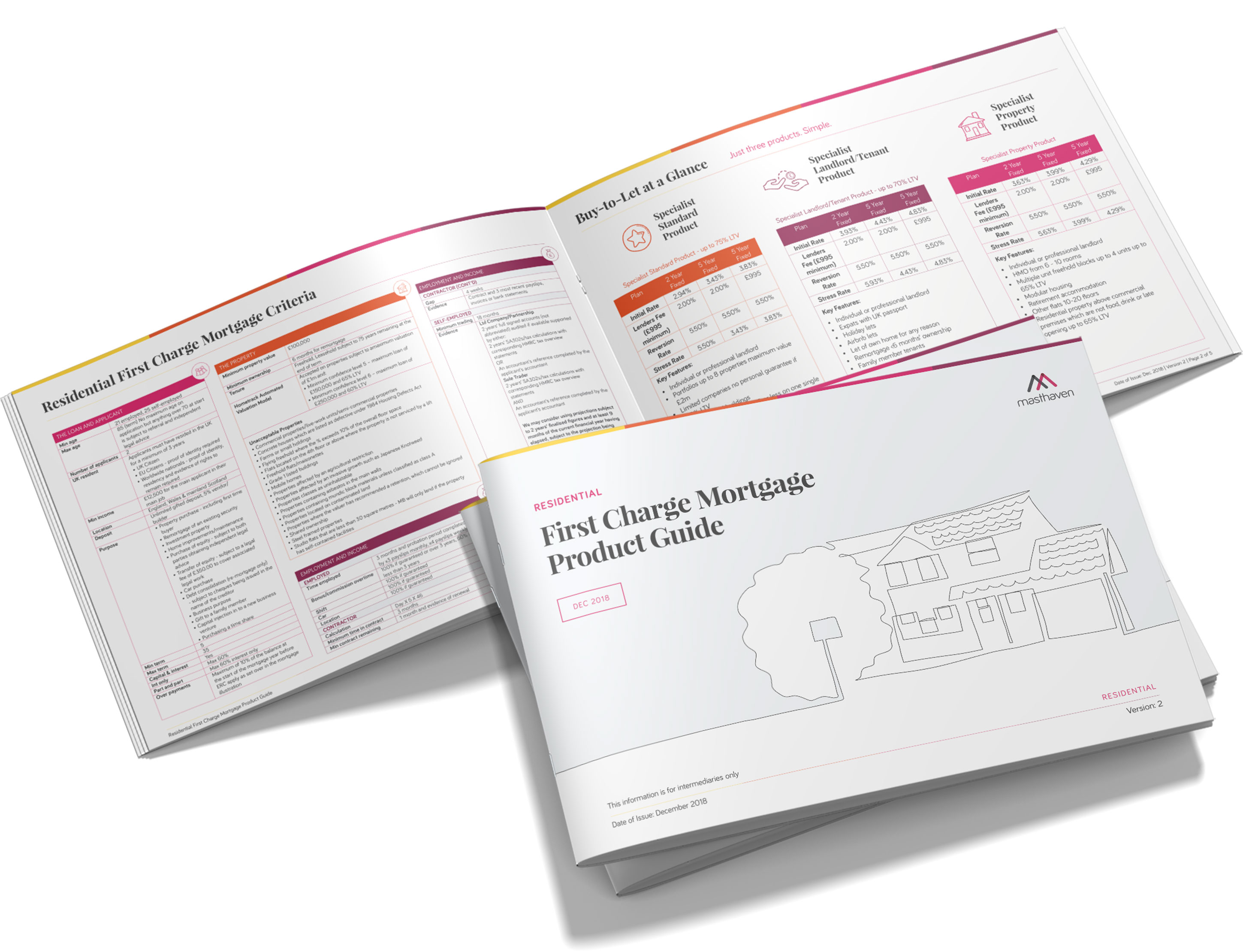
We applied Masthaven’s new brand guidelines to their existing collateral in both digital and print, including business stationary and product guides.

Website
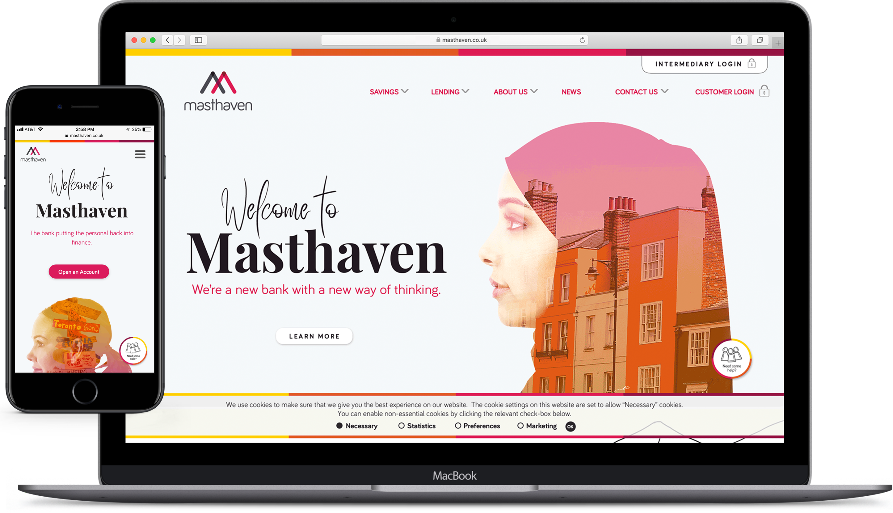
In addition, we designed a new website based on the rebrand for both desktop and mobile devices.

Results
Masthaven could not have been happier with the result of the rebrand. It was rolled out successfully across all mediums in early 2019 and met with praise throughout the company.


